So I have picked Brief 3, in order to do the brief I have to
think about the logo for the band. So here is a couple of examples of band
logos.
I believe the logo has to be attractive and stand out from
all the rest. The logo is important as it helps promote the band and helps
people recognise the band.
What I've found out about band logos is that they do change
from time to time.
This is Sleeping With Sirens logo.
It is bold, so the people can recognise it's the bands logo and who they are.
Even though Sleeping with Sirens have many logos, this one is the most
famous. I also chose this logo because even though there are two colours, it
makes the logo stand out more and the colours have a good contrast. The font is
bold which makes it stand out more to people. The text is joined up this makes
the logo look more attractive.
 This
is a band called Pierce the Veil logo. Like sleeping with sirens' logo it only
uses two colours which are a good contrast with each other, as it makes the
logo bold and stand out from the rest. The way the font is for the text is very
attractive and effective. This helps the band to stand out. The font and the
layout of the logo makes the logo interesting. Also the font is quite unique as
you don't see much band logos with this sort of font.
This
is a band called Pierce the Veil logo. Like sleeping with sirens' logo it only
uses two colours which are a good contrast with each other, as it makes the
logo bold and stand out from the rest. The way the font is for the text is very
attractive and effective. This helps the band to stand out. The font and the
layout of the logo makes the logo interesting. Also the font is quite unique as
you don't see much band logos with this sort of font.
 This
is Panic at this disco’s logo. This is a
very attractive and it stands out from all the other band logos. It’s a very
unique logo, as you never see any one with the same font and look to it. Also
it is a weird design as well as unique, which also represents the band itself,
as the band is very weird and unique and not like other bands. They do
different genre styles for each album, and they never sound like other bands
out there which makes them quite a unique band, so their logo actually
represents them.
This
is Panic at this disco’s logo. This is a
very attractive and it stands out from all the other band logos. It’s a very
unique logo, as you never see any one with the same font and look to it. Also
it is a weird design as well as unique, which also represents the band itself,
as the band is very weird and unique and not like other bands. They do
different genre styles for each album, and they never sound like other bands
out there which makes them quite a unique band, so their logo actually
represents them.

This logo is the summer sets logo. It is very
plain and simple, however it is a good representation of the band as it has the
initials of band within the logo. The bold, this is shown by a good contrast of
colours and because it only has the initials in it looks a lot bolder.
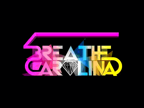
This is breathe carolina’s logo. It is very
colourful and bold and very attractive. This logo represents the band really
well, because the band is very electronic rock, and this logo really shows the
electronic part of the bands through the bright colours. It also shows how fun
and different the band is in comparison with the other bands and this is shown
by the logo, because the logo is different in comparison to others.
No comments:
Post a Comment