In doing my research, I have redone my research task 1 and added more to it.
I believe that a logo has to be attractive and stand out
from all the rest. The logo is important as it helps promote the band or the
company and helps people recognise the band or company. In order to do my research
I have to think about the qualities of a logo and how they get their point
across to the audience. In my research I have found out that to have a good
logo, the design has to be simple, memorable, timeless, versatile and appropriate. If a logo is simple it means it is
going to be recognise easily by the audience, it also helps to make it
memorable and versatile. A logo should be memorable because the audience
will always remember that logo and remember what that logo is
representing. Logos have to be timeless,
the designer has to think about will it be effective in 10, 20, 50 years time. If
the logo is timeless then the change in appearance wouldn’t have to happen so
many times. A good logo has to be versatile so it
can work in a variety of mediums and applications, logos should be functional meaning
the logo can be resized to fit the advertisement without any disfigurement of
it. In order to create a logo so versatile it should be designed in a vector format,
as this is what makes it easier to resize it without any disfigurement. A good logo has to be appropriate. This means the logo has to fit in with
whatever the product is or whatever the advertisement is. So for example if you
logo is representing something for children, the logo would have to look fun
and colourful to attract children.
So I have picked Brief 3, in order to do the brief I have to
think about logos and I will research logos. I will think about how they look
and how the audience sees them and can identify which logo goes to which
company or band etc. So here are a couple of examples of band logos and some explanation
of why I chose these logos.
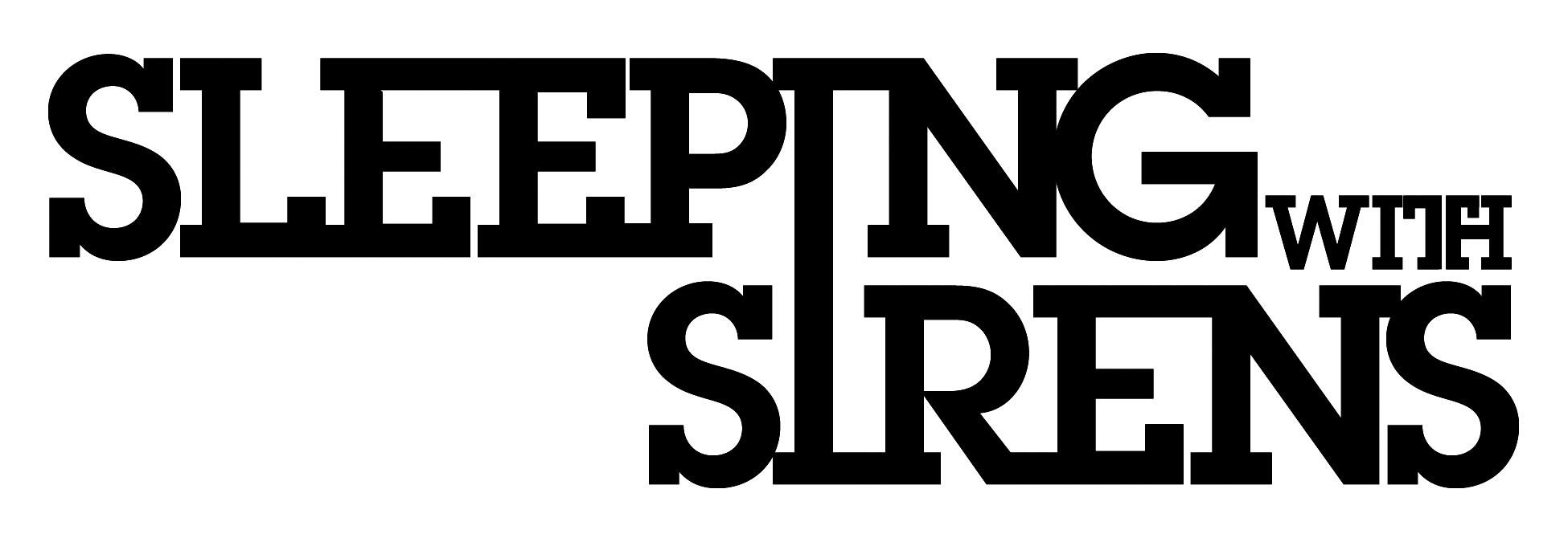
This is Sleeping with Sirens logo. It is bold, so the people
can recognise it's the bands logo and who they are, also the denotation of this
being bold could come across to the audience, it is shouting in a way. However this
is a connotation as this instantly shows the audience what type of music the
band play because they do scream in their music. This only has two colours, it
makes the logo stand out more and the colours have a good contrast. The font is
bold which makes it stand out more to people. For the audience that know who
that band are and they might know the meaning behind then name is that the
sirens part are the mythological creature (mermaid like) who lure sails with
their beautiful voices and as the sails came towards them they would crash into
the rocks of the sirens and die, so the fact that they are “sleeping with
sirens” could show that they are joining forces with the sirens, this could be
a reason to why the two “I’s” in the logo are joined into one, it could represent
the joining of the forces. However for those who do not know that band that well the joining of
the letters could represent the joining of them band coming together in order
to create music and connect with their fans through their music. The colouring of white text on a black
background shows boldness and makes the logo stand out which could represent
that the band is a band that is different and stands out from the rest of the
other bands in their industry. Going back
to what I have researched it is simple, memorable, timeless and appropriate.

This
is a band called Pierce the Veil logo. Like sleeping with sirens' logo it only
uses two colours which are a good contrast with each other, as it makes the
logo bold and stand out from the rest which could also show that they stand out
from everyone else in their industry. The way the font is for the text is very
attractive and effective as it is simple which helps it to be memorable and
helps with the timing part as it will be a good logo to have for a while. This
helps the band to stand out. The font and the layout of the logo makes the logo
interesting. Also the font is quite unique as you don't see much band logos
with this sort of font. The font of the
text could represent the band itself as it is curled which could represent the
bands personalities as the font it fun looking which could mean the bands
personalities are fun however the font is quite defined and pointed and serious
looking which could represent how serious the band is about making music. So the
font could show both sides of the personalities on the band.

This
is Panic at this disco’s logo. This is a
very attractive and it stands out from all the other band logos. It’s a very
unique logo, the font of this logo has never been seen before, it makes it
memorable for the audience and it easy to recognise that this is the bands logo
and who the band is. Also it is a weird
design as well as unique, which also represents the band itself, as the band is
very weird and unique and not like other bands. They do different genre styles
for each album, and they never sound like other bands out there which makes
them quite a unique band, so their logo actually represents them. Also the font is quite old fashioned in some
ways. This logo is seen on the bands album “ vices and virtues” and the music
on that is a bit like the songs they use to create when the first got signed,
so this logo could look old fashioned like to represent that the album going to
have songs on their in which are like their older stuff and the curls on the
font could represent that the album have a twist to it.

This logo is the summer sets logo. It is very
plain and simple, meaning that this logo is going to memorable, so the audience
can easily identify who the band is. It is a good representation of the band as
it has the initials of band within the logo. The logo is bold, this is shown by
a good contrast of colours and because it only has the initials in it looks a
lot bolder. The way this logo is set out is like a hierarchy system, the way
the t and the two S’s are, however by the looking at the logo the two S’s are
bigger showing that they are more important even though they are on the bottom
of the hierarchy system. This could represent that the summer set have a
message in their logo saying that people like the fans are more important than
the famous rock stars, so the S’s could represent the fans and the T could
represent the band. This logo could be telling their audience that their fans are
so important to them. The triangle is the outline the hierarchy of
letters. This logo is very simple yet
the message within it is quite deep. This is a good logo to have because it is
simple, memorable, and appropriate and it has a message to get across. It also
could be timing because it is so simple the band doesn’t need to make it
complex as the message stands out.
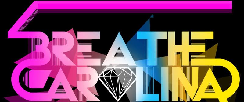
This is breathe carolina’s logo. It is very
colourful and bold and very attractive. This logo represents the band really
well, because the band is very electronic rock, and this logo really shows the
electronic part of the bands through the bright colours. It also shows how fun
and different the band is in comparison with the other bands because the logo
is different in comparison to others.
By using such
bright colours it could also represent who the band is aiming at for their
audiences, the bright colours could show that the audience is a younger
generation, as the bright colours would attract them more to the band. The fact that the background is black and all
these bright shining colours are shining through this could represent of what
they believe their band is like within the industry. The logo represents that
they are different in comparison to the bands in there industry. The black background
could represent everyone else in their industry, then everything else is them. The
diamond could represent that this is the best they have been in their whole
time as working as a band and creating music, because diamonds stereotypically
known as for the best thing, that are really expensive. This could be
representing their perspective on how they see their band getting on.

This is a record company called
Rise Records. The logo is very bold and in the audiences face. This could
represent that the company isn’t like the rest, as it is bigger and better them
all the others. The first thing that will catch the audience’s eye is the big
capital R, this instantly attracts the audience and makes them want to know
what this R means until they look closer to logo and see Rise Records. The R
could also represent rock music as this is what the record label sign, they
sign rock bands and help them create rock music. It is black and white which makes it bolder
and stand out. It also has a sense of professionalism and because it only them
to colours it gives a sense that their audience can be of any ages depending on
whether they like the music they sign and produce.


